
I want to provide accessible resources
With some changes to the way we deliver learning materials, we can have a huge impact on accessibility – for everyone.
Creating Accessible Content
Text
When accessing a document or page with text the learner may need to change the size/colour of the text or the colour of the background. If the text cannot be manipulated then it is inaccessible to that learner – no matter what additional formatting is included.
The text must also be accessible to a screen reader.
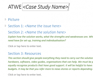 Using “Styles” in Microsoft Word creates an interactive contents list that can be used as a document summary for learners with a print impairment (e.g. dyslexia or visual impairments). It gives a consistent layout and makes navigation easy for any reader. You can change all headings or all body text quickly and easily which makes this feature a must. Microsoft has provided a helpful video on Using Styles in Word.
Correctly structured documents allow for easier conversion to other formats, such as PDF and HTML.
Images
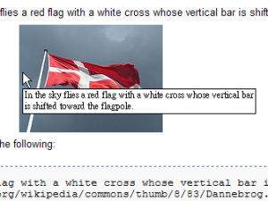
When using images it is essential to provide the information as text. Not all learners will be able to either see or interpret an image. This can be achieved in several ways, including describing the image in the text of the document, adding a caption, or adding an alternative text description.
Any description should contain only relevant information. Think about why the image is there in the first place. If it is purely decorative then there is no need for Alt text. There is no need to put “picture of…” or “this image shows” in your Alt text. The person accessing it will know it is an image as their software will show it as Alt text, not part of the body of information.
Microsoft provides a helpful video on how to Improve accessibility with alt text.
Video
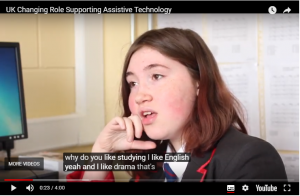 There are many reasons why subtitles are helpful for learners. The BBC recently published a report stating that 20% of their iPlayer downloads were accessed with subtitles. This illustrates that accessibility features are beneficial for a wide range of learners not just those with disabilities.
YouTube now automatically includes subtitles by default. A plain text transcript can be uploaded to YouTube and the text will automatically synchronise to your video. This is much more accurate than YouTube auto-captions.
When creating either audio or video content it is good practice to do so from a script. For video, it is also good practice to use a shooting script. Both of these will help to provide a transcript once the audio or video is complete, along with subtitles. If you use a shooting script it can also give you good prompts to provide an audio description track for blind learners.
Books
Printed text can be difficult to access. The difficulties could be turning the pages, viewing the text or concentration. Fortunately, there are resources to help with this; RNIB Bookshare has over 140,000 titles to work with.
If there are books that you can not find in print then remember there are copyright exceptions for those with disabilities, meaning that it should be permissible to make an accessible copy. Full details are here on the Government’s Exceptions to copyright page.
Websites
Many organisations provide an intranet page or similar for their learners, you can follow the above guides for pointers on text, images and videos – but here are some additional pointers:
- Avoid large blocks of text and break up text with bullets or numbered lists
- Don’t use any font smaller than 10pt and avoid text in capitals
- Links should be easily seen – use a different colour and underline
- Ensure that the text of a link makes sense. Avoid ‘click here’ or ‘link’.
- Add Alt text to all images and/or graphical representation of information.
- Order your content in importance
Colour Blindness
Some useful rules for creating resources that take into consideration this are:
- Don’t only rely on colour to convey a message
- Keep your colour palette limited to 2 or 3 colours
- Use texture and patterns to show contrast
- Carefully select any contrasting colours and shades
- Avoid using bad colour combinations
For further details, you can read this helpful blog on How to Design for Color Blindness.
This article also relates to
I want to use technology to support my teaching
Questions?
If you have questions about this or other assistive technology related topics please get in touch with TechAbility.